Higher Ground
Category: Branding, Mural Design
When Higher Ground learned their logo was plagiarized, they turned to me for a full rebrand. The timing aligned with their expansion from a court rental service into a sports and lifestyle brand, complete with clinics, training, meals, and merchandise. They needed a logo that moved beyond a basketball emblem to reflect a modern, versatile identity.
What work was done
Higher Ground is a sports & lifestyle facility in Diliman, Quezon City. The three-story building houses a full-sized taraflex basketball court, an in-house restobar, and a merch store for their startup athleisure brand.
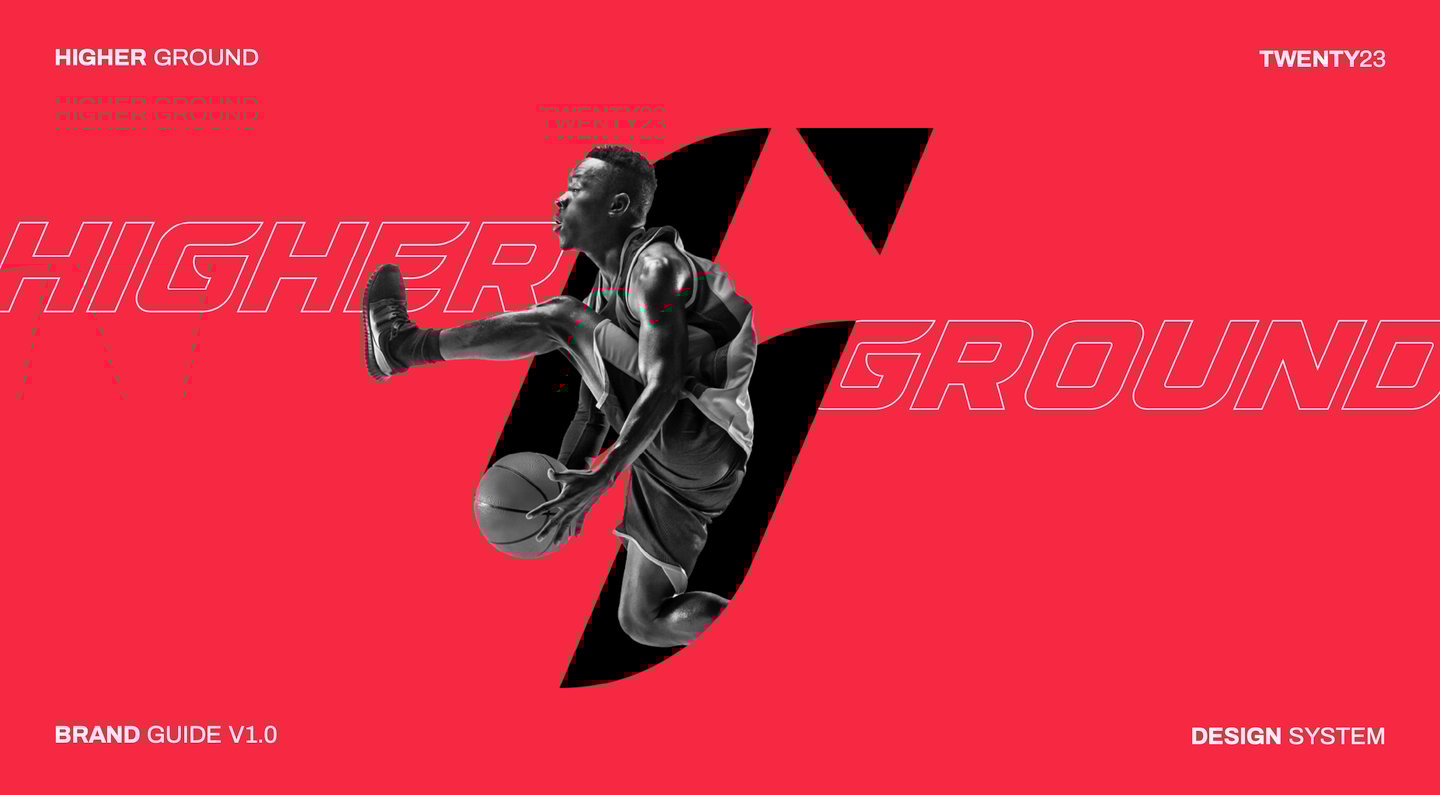

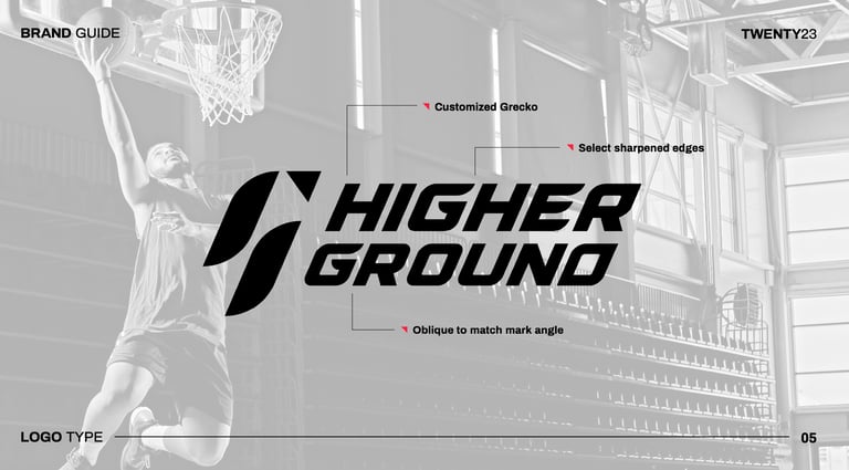
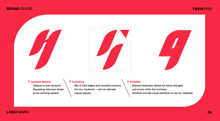
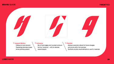
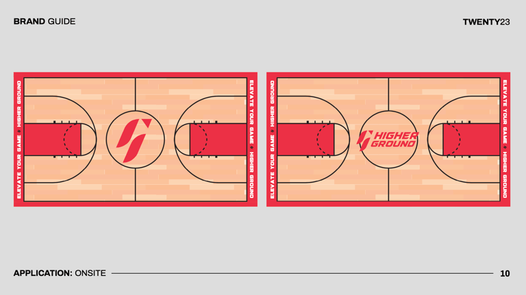
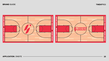
The logo resembles a lowercase h and an uppercase G. It also features an upward arrow, with a slight tilt to indicate motion and movement. This logo fits the overall objectives for the logo which were: motion, inclusivity, and flexibility.
The tilt and angle suggests upward movement and elevation, with the sharp corner of the upward arrow providing a bit of edge to offset the friendlier, rounded contours of the 2 main shapes. The logo was also designed in such a way that it wasn’t a direct nod to basketball, with elements you can take apart and plug into the brand’s design system.
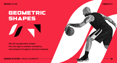
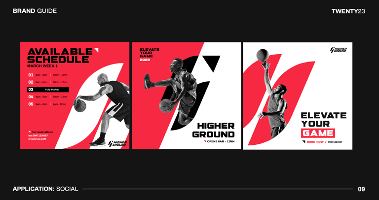
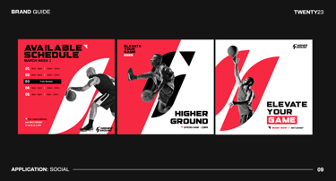
Higher Ground has an in-house photographer who captures their games. To boost engagement, geometric shapes were intentionally designed to complement member photos, allowing them to be seamlessly featured in future posts.

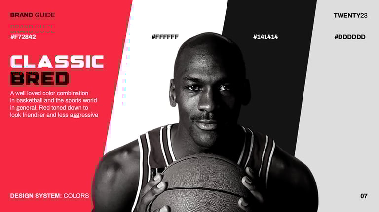
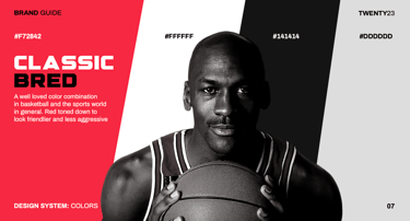
As a nod to the brand's basketball roots, I selected a color palette that is well known in the sport, thanks in large part to the success of the Michael Jordan era's Chicago Bulls.
Liked this project?
Check out my other project for Higher Ground: merch design, packaging, and social media content for their clothing brand, Higher Ground Design Studio. If you have a lifestyle and fitness brand in need of a rebrand, hit me up!